
Are you staring at a seemingly endless array of paint colour options? Feeling overwhelmed and unsure even where to begin? Don’t worry, you’re not alone! We’ve all been there, standing in front of those paint charts with countless hues, shades, and tones, wondering which one is the perfect choice.

But fear not. Here are the only 3 questions you need to find your paint colour.
In just a few minutes, you’ll have a clear direction on how to choose the ideal paint colour for your space. We’re here to simplify the process and make it an enjoyable experience, rather than a daunting task.
I’ll walk you through three straightforward questions that will help you shortlist paint colours in under ten minutes, and by the end, you’ll be well on your way to creating a space that reflects your style and personality.
3 SIMPLE QUESTIONS TO FIND YOUR PAINT COLOUR
1. DO YOU WANT WARM OR COOL?
Warm and cool colours have something different to bring to the table. So this is a good starting question for shortlisting paint colour.
WARM COLOURS

Warm colours will make a space feel welcoming, cosy, warm and inviting. So these colours are great for rooms where you want to encourage activity and conversation. Idea for living rooms, dining rooms and kitchens. They are also great for hallways where you want to create a welcoming first impression to your home. They are also pretty necessary for any rooms that appear cool, such as north-facing rooms that receive a flat, cool, natural light. Or rooms that are physically cold, such as a room that is poorly insulated or doesn’t get any sun.
So if this sounds like the kind of feeling you want to create then look for colours or whites that have yellow, orange, red or pink pigments. These are your colours from the warm end of the spectrum that are going to create cosy, homely vibes.
COOL COLOURS
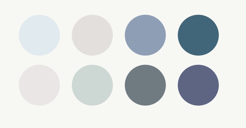
Cool colours will make a space feel large, open, airy and calming. These colours are great for rooms where you want to create a sense of space with a calming atmosphere, perfect for rooms like bedrooms and bathrooms or a grand hallway. They are also great for very sunny rooms, particularly those that have a lot of glazing, where you want to enhance the feeling of light and space. Or rooms that can get very hot or stuffy in the summer like loft rooms or small, south-facing spaces.
Cool colours are derived from blues, greens and purples, those zen, calming colours that often remind us of nature. So if you want your room to feel as large and airy as possible, or as calming and tranquil as possible then seek out these colours from the cooler end of the spectrum.
2. DO YOU WANT DARK, MID-TONE OR PALE?

DARKER COLOURS
These will make your room feel super cosy, enveloping, decadent and impactful. Painting your walls dark is such an easy way to make a statement in a small room. They are perfect for snugs, living rooms and any small or cosy spaces.
MID-TONE COLOURS
These can make a room feel very elegant but understated. These colours are great for adding visual impact but without dominating the space. I love them in bedrooms, smaller hallways where there isn’t a lot of room for furniture, and rooms used mostly in the daytime such as playrooms or living rooms.
PALES OR WHITES
These will make a room feel as large as possible and will take a backseat, allowing other elements of your scheme to take centre stage.
3. DO YOU WANT A PURE OR MUTED COLOUR?

Muted colours have more grey in them so are generally perceived as more calming and relaxing, choose more muted tones if you find brighter, more engaging colours a bit overbearing.
Pure colours are more vibrant and stimulating, go for these if you want to create a more cheery and energising feel.
USE THE PROCESS OF ELMINATION…
If you choose a brand with a sensible edit of colours, say 100 – 150 colours, take their colour card and a marker and run through these questions you can literally cross out all of the colours that don’t apply and you’ll be left with a sensible number of paint testers to order.

I’m usually drawn to warmer, muted colours as I like a cosy and calming vibe, and I’m not one for very bright, high-energy colours. I’m very happy with either very dark or pale colours, but you don’t see a lot of mid-toned colours in my own home, it’s normally one extreme or the other. I think I like the contrast of transitioning from darker to lighter spaces 💜.
Why don’t you try this process of elimination and let me know how you get on 😀.
Happy decorating,
Sarah x


Hello Sarah My name is Maddie and your page caught my eye. I am currently planning to decorate our bedroom which is presently a cool share of pale dirty yellow. The room faces West and due to I’ll health I spend a fair amount of time here. The room sings in the afternoon sun and then fades all too quickly. My leaning is towards the mid gone peaches but my husband says it’s fine as it is! I recently bought a yellow once fitted understeer and a finding quilt with bright white flowers with pink centres and green leaves. It certainly cheered us but is actually quite intense. Most of our bedding is pale pink or white. We will also need a carpet and curtains so can you suggest a bus for one wall behind our bed? Hope this is not too long! Many thanks Maddie