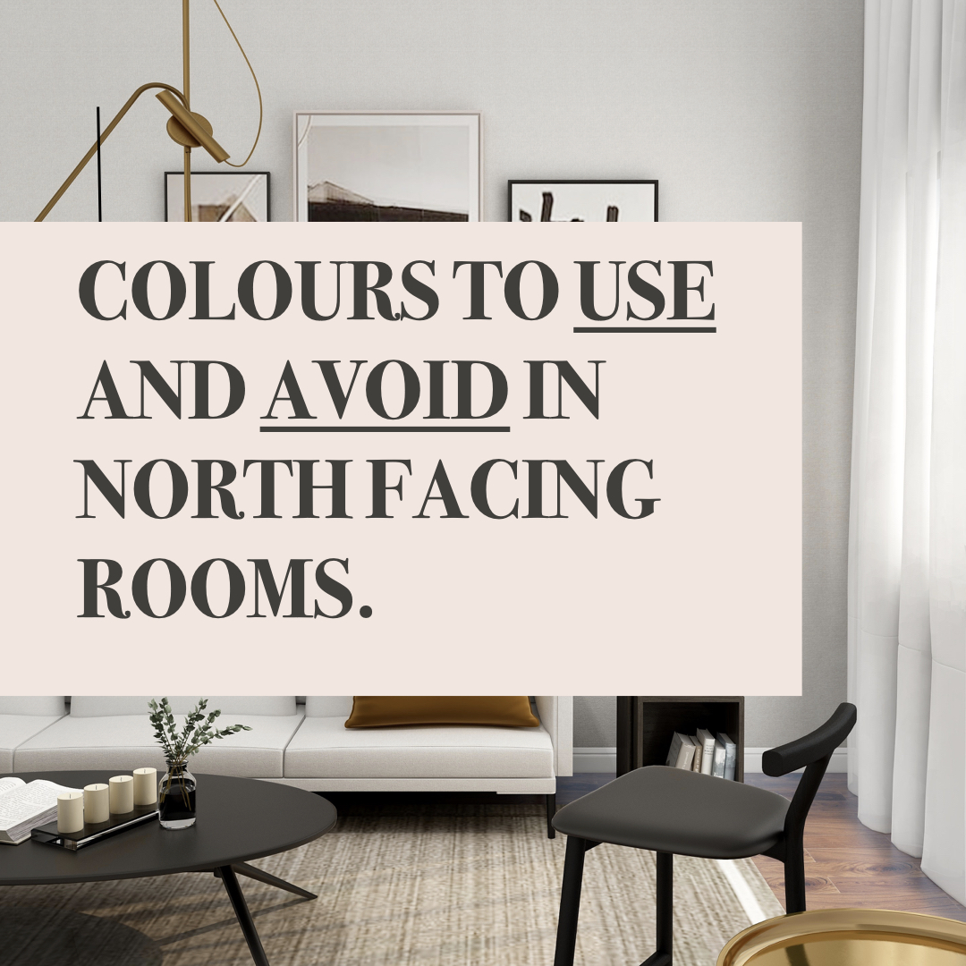
Paint colours for north-facing rooms can be a challenge, right? But don’t worry, I’ve got you.
-
You don’t get any direct sunlight shining in through your window.
-
You will get indirect light, which basically means the sunlight reflects off other things, like the side of a building, into your room.
-
The light will be quite greyish and flat which can make the space feel a bit gloomy and cold.
-
The light will be consistent, so it will have the same feeling in the morning as it does in the afternoon.
So the upshot is that your room is never going to feel glorious and sunny. The physical temperature will be cool and the quality of the light is also cool, which basically makes for a chilly feeling space.
So how to decorate a north-facing room?
You have three options…
1. Warm off-whites and neutrals
If you want to make your gloomy room feel as light and large as possible then an off-white is going to be your friend. BUT it must have the right undertone (which basically is the base colour). And the right undertones are yellow, red, pink or brown. These colours are from the warm end of the colour spectrum so they are going to give your white a warm cosy feeling.
TRY
Avoid…
Any whites that have blue, green or grey undertones, including pure brilliant white. These colours are from the cool end of the colour spectrum so are going to make a gloomy room feel even colder.
2. SOFT PINKS
TRY…
Setting Plaster by Farrow and Ball, Powder Colour by Dulux Heritage, or Castell Pink by Little Greene.
Visit our freebies page on our new website to download the full list of recommended paint colours 😀
3. DARKS
TRY..
Anything deep and dark that takes your fancy. My favourites are ‘Green Smoke’ Inchyra Blue and ‘Brinjal’ by Farrow and Ball. Or have a look at ‘Scree’, ‘Nether Red’ and ‘Livid’ by Little Greene.
Visit our freebies page on our new website to download the full list of recommended paint colours 😀

I hope this has been helpful. But if you still need help don’t forget I offer my in-home colour consultancy so let me know how I can help by getting in touch here.