
I’m so glad you’re here!
Because if you’re curious about how the colour wheel works then you probably are trying to put a colour scheme together, and that is something I can absolutely help you with 🙂
The good news is, even if you have no creative flair or colour-know-how you can still put together a beautiful scheme using the colour wheel.
The bad news is the theory of the colour wheel can be a bit dry. And I’m sorry about that. But stick with me because it’s totally worth the effort. Once you understand the power of the colour wheel you will be putting colours together like a pro. So let’s get started.

WHAT IS THE COLOUR WHEEL?
Well, it’s a super amazing tool that can help you create beautiful colour schemes. But to get to that part we need to understand a bit more about it.
Basically, it’s a wheel invented by Isaac Newton in 1666 who organised the colour spectrum into a wheel to demonstrate the relationship between all the colours.
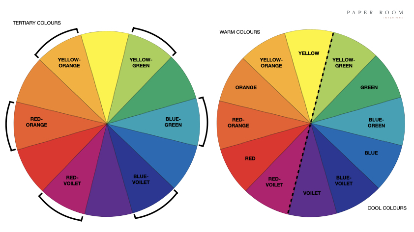
It has 12 colours.
The Primary colours are RED / YELLOW / BLUE. All other colours (in the entire World) are created from these three colours.
Secondary colours are created by mixing two primary colours together so you get: ORANGE / GREEN / VOILET (or purple if you prefer).
Tertiary colours are created by mixing a primary colour with the secondary colour next to it on the wheel so we get: RED-ORANGE, YELLOW-ORANGE, YELLOW-GREEN, BLUE-GREEN, BLUE-VOILET, RED-VIOLET.
Of these 12 colours 6 of them are warm colours and 6 of them are cool colours.
GIVE ME MORE JARGON!!
If you’re already glazing over then skip this part. But if you want to know more then here are some fun facts!
HUE – Refers to the origin of a colour I.E the primary, secondary or tertiary colour, many thousands of colours are then created by mixing white, black or grey with the ‘hue’.
TINT – A hue mixed with white.
TONE – A hue mixed with grey.
SHADE – A hue mixed with black.
COOL COLOUR – This refers to the temperature of a colour, the cool colours are any colours derived from blue, green or violet.
WARM COLOUR – Any colour derived from red, orange or yellow.
HOW ON EARTH DO I USE IT?
So the really clever thing the wheel does is it visually demonstrates the relationship between colours so you know whether or not they go together.
I’m going to show you five types of colour scheme you can create using the colour wheel.
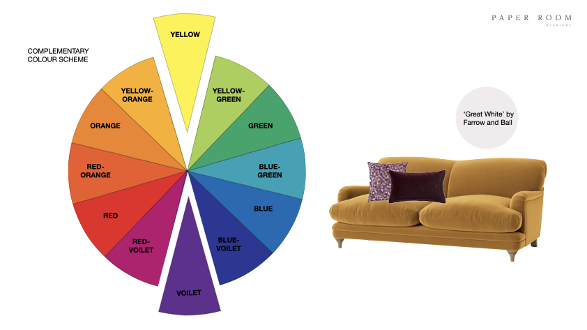
1. COMPLEMENTARY SCHEME (ALSO KNOWN AS CONTRASTING)
This scheme is made up of two colours that sit directly opposite each other on the colour wheel. One will be a warm colour and one will be a cool colour. So if you want to feature yellow in your scheme then violet sits directly opposite yellow on the colour wheel, so it’s the perfect complementary colour to use in your scheme.
Complementary colours create a strong contrast so as a colour scheme they can be very high energy and dynamic. Perfect for spaces where you want to feel energised and stimulated. But you can also tone down a complementary scheme to suit more calming spaces.
EXAMPLE
Let’s Say you are ordering a yellow velvet sofa for your living room and want to know what colour to paint your walls. Well violet wold be the perfect colour. But is that too much for you? It could be. So rather than using violet on the walls try using a neutral with a violet undertone such as ‘Great White’ by Farrow and Ball, then place a violet colour cushion on the sofa, that little pop of purple will look fabulous.
2. SPLIT COMPLEMENTARY SCHEME
This is like the complementary scheme we already looked at, but it uses three colours instead of two. Choose one colour, then use the two colours on either side of its complement. This works when you use a single colour as the main colour within the space, and then the two complementary colours as accents on smaller pieces within the room.
EXAMPLE
If you wanted to use a blue as your main colour say on a large sofa, then you could use a neutral on your walls then add some smaller accessories such as cushions, a throw and a lamp in red-range and yellow-orange.

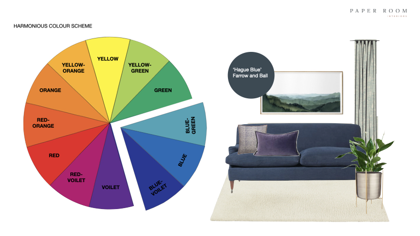
3. HARMONIOUS SCHEME (ALSO KNOWN AS ANALOGOUS)
This scheme is made up of three colours that sit next to each other on the colour wheel. Because the colours are next to each other there is very little contrast between them making it a perfect scheme for relaxing spaces. One thing to be wary of with this kind of scheme is it can feel a bit flat as it’s all a bit samey. So the way to remedy this is to use the three colours in different proportions. Use one as a main or dominant colour, and the two colours on either side as accent colours.
EXAMPLE
This time let’s imagine we’ve got a gorgeous blue sofa and blue walls as our dominant colour. So we could use a blue/green fabric on the curtains and artwork, with some blue/violet cushions, because these three colours sit next to each other on the wheel. Perfectly harmonious and calming.
4. TONAL SCHEME (ALSO KNOWN AS MONOCHROMATIC)
This is probably one of the easiest schemes to put together as it’s made up of varying tones of a single colour. So there isn’t much that can go wrong. Start by picking one colour you love. Then seek out various lighter and darker shades of that one colour. This might sound a little bit boring but you can actually make the scheme feel very dynamic. Use a much darker and lighter version of the colour right next to each other to provide some contrast. The other trick is to use lots and lots of texture, particularly if you are going with a more neutral scheme.
EXAMPLE
Let’s take green as our single colour. We could use a forest green paint colour on some wood panelling, some beautiful green wallpaper above it, a white paint with a green undertone on the ceiling and woodwork, and a green upholstered headboard. Lovely!

5. TRIAD SCHEME
This scheme is made up of three colours that sit equally spaced from each other on the colour wheel. Again, this will work best if you choose one as the dominant colour and the other two as accents. You can really have fun with this type of scheme and bring together some wonderful colours.
EXAMPLE
So a triadic scheme could be blue, yellow and red, as these colours sit equidistant from each other on the colour wheel. Now, I know what you’re thinking, that would look disgusting! But remember we can use any tints, tones and shades of our colours. So let’s try a navy sofa, with some mustard-coloured cushions and a lampshade in a red fabric. Not so disgusting now (IMO).

FINALLY DON’T FORGET YOUR RATIOS
So now we know how to pick our colours the other consideration is the proportions in which to use them. Get this wrong and your scheme could be a fail, which you definitely don’t want after you’ve done such an amazing job with choosing the right colours. Whilst we’ve touched on it a bit here there is always the 60/30/10 rule to fall back on if you are worried you’re going to mess it up. You can read all about that here.
YOU MADE IT!
Well. I’m totally impressed if you’re still with me and have read this far. Colour theory can be pretty heavy going but you’ve now got this as a reference point. It’s way too much to take in at once, so bookmark this post so you can come back to it anytime. And why not treat yourself to a colour wheel, they are great for taking with you when shopping for furniture and accessories.
Drop a comment if you have any questions and I will always try to help 🙂

HIRE ME
And remember you can aways hire me to do the hard work for you! I offer my colour consultancy service and interior design packages across Southampton and Hampshire. Click here if you would like to set up a free discovery call to learn more about how I can help you.
Happy colour scheming x


The most helpful article I’ve read on color schemes. Thank you!
You are very welcome! Thank you for the feedback and good luck with your own colour scheme projects 😀.