When discussing a new project, clients often say to me they want their room to ‘flow’. Or they want it to feel ‘put together’ or have a ‘good feel’ about it. And they all know in their hearts exactly what they mean by that. But putting it into words is a completely different matter. It’s often hard to explain. So if we find it hard to describe the feeling we want, it’s no wonder we find it frustratingly hard to achieve.
When we spend time discussing it, it normally comes down to people wanting a cohesive scheme. When a room is cohesive everything works together and it just feels right. So here are my top tips for creating that illusive cohesive, flow, put together, good feel kind of feeling.

1. LOOK FOR A COMMON THREAD
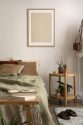
Long gone are the days of buying a coffee table with matching side tables, sideboards and book shelves (because we are now much cooler than that!). Our homes should be a reflection of our personality and style, not the reflection of a Next Home catalogue. So whilst it’s a big no-no to go all matchy, matchy, you do want your furniture to work together. So HOW the hell do you do this? The answer is to just look for a common thread. Look for details that will tie two pieces of furniture together. It may be colours, materials, texture, scale or shape that mean they work together nicely. See the image below and how the coffee table and side table work together nicely even though they are different. The common elements here are the legs, they are both metal and straight (as in no twiddly details) and the proportions are also similar (in that it’s a nice chunky top on a relatively thin frame).
Things don’t have to be a perfect match to look good together. But they do need to get on. So look for common elements that mean your furniture will be firm friends.
2. LIMIT YOUR STYLE MIX TO JUST TWO
So whilst it’s cool to mix a mid-century sideboard with a contemporary bookcase, or an antique bureau with an industrial-style coffee table. Don’t get carried away. Make sure you stop at 2. Don’t mix up all different periods of furniture because if you do it will start to feel messy, and that’s when you disrupt the flow you are after. This can easily happen it you have received hand-me-downs or simply collected furniture over many years. So if you are looking to redecorate or redesign then start by looking at your furniture. If your furniture is interrupting your flow then it doesn’t matter what else you do with the the room. You can throw as many cushions or accessories as you want at the problem, but it’s never going to feel right. So it may be time to sell the hand-me-downs, donate them to charity, and invest in some pieces of furniture that will work together. If styles of furniture confuse the hell out of you then just Google it or get someone round to help, like me!
3. USE COMPLIMENTARY AND CONTRASTING COLOURS
This is easier than it sounds, go and Google ‘colour wheel’ and you’ll see how easy peasy this is. So you have a beautiful blue velvet sofa (yes!) and you don’t know what colour cushions to use. Take a look at the colour wheel and find your blue. You will see that on either side of your blue are darker and lighter shades of blue, aquas and greens, these are your complimentary colours. So cushions in these colours will work. Opposite your blue will be some kind of yellow, this is your contrast. All these colours will look great. But chuck a purple cushion on there and it could start to look off. This is because purple is neither a complimentary nor a contrasting colour for your blue. Don’t get me wrong it can be very cool to clash colours but if you’re looking for an easy-on-the-eye, cohesive feel then complimentary colours are your best friend.
4. MATCH YOUR METALS
What I mean by this is the metallic details that are all around our homes, light switches, power sockets, door handles, curtain poles, and lamp stands. Matching is easy if you are starting a room from scratch but can be tricky if you already have things you are working with. Your room will feel more cohesive and flow better if you stick to one type of metal. But if you do end up having to work with a mixture, like brass and chrome for example, then grab yourself some accessories that combine the two. This celebrates the mix of metals and shows it is a deliberate choice. Accessories like this will help your use of chrome and brass to feel more cohesive.
5. BEWARE OF TOO MUCH WOOD
This is a common problem for us as we often default to wood for our furniture as it’s warm, tactile and really durable. But if you start mixing lots of types of wood it can start to look like a big old mess. So stick to 2 at the most and contrast if you can. Pine and walnut for example create a nice contrast, whereas pine and oak are very similar so can sometimes clash. Another trick is to keep the woods separate, so this is easy if it’s two pieces of furniture at opposite ends of the room, but harder if it’s a wooden piece of furniture on a wooden floor. So if you want to put an oak table on your pine floorboards then break it all up with a beautiful rug, or paint the legs so they contrast with the floor.
6. DON’T FORGET YOUR FLOOR
People will often think a cream carpet or neutral wood floor will go with any neutral, off-white wall colour. Nope. This is definitely not true. If only it were that easy! It can be very tricky combining neutrals as they all have a particular undertone which can clash horribly. So don’t assume your cream carpet will go with any wall colour. Always, always see how your paint swatches work with your floor to ensure it will create a cohesive scheme. So this means you can’t just paint a sample swatch of paint halfway up your wall. Either paint another sample just above the skirting or, better still, paint your sample onto a large piece of card that you can lay on your floor and also move around to match with other colours within the room.
7. REPEAT AN ACCENT COLOUR
This is the easiest way to make a room feel cohesive, pick your accent colour and dot it around the room so it appears on every wall and ideally at varying heights. So it may be a blush pink colour that you have picked out from the rug on the floor, that is then in a cushion on the sofa, that then appears in a print on the wall and then in a vase on the sideboard. By dotting the colour evenly around the room you create a lovely rhythm that takes the eye on a journey all around it. This is another common thread that will be pulling your scheme together.
8. STREAMLINE YOUR ACCESSORIES
Just like with our furniture, we can’t throw everything together and expect it to look great. So when if comes to your accessories stick to just a couple of materials for a cohesive feel. This means you can combine your ceramic vases with your paperback books and wooden sculptures, but don’t also throw in your wine glass collection and your metal photo frames. Stick to just a few materials and your accessories will look harmonious.
So there are 8 easy-ish ways to create that ‘hard to put your finger on’ feeling in a room. If you would like some support then let’s redesign your room together. Click here to get in touch and let me know what I can help you with.